Why do some designs frustrate users, erode trust, and drive them away?
When users visit a website, they are not just looking for information; they enter an emotional space. Every design element—from color and font to animation, advertising, and speed—can create a positive or negative feeling. The problem is that many designers think only about “beauty,” not about the user's emotions.
This article examines which design choices cause the greatest emotional harm and how to avoid them.
Why Do Design Mistakes Create Negative Feelings?
When people visit a site, their brains immediately ask a few key questions:
- Is this space safe?
- Is this brand trustworthy?
- Is this page for me?
- Is it easy to use?
If the answers are unclear or negative, the result may be feelings such as:
- Distrust
- Disorder
- Frustration
- Overwhelm
- The urge to leave
Below, we examine the most important mistakes that create these negative feelings.
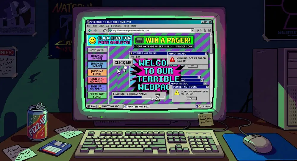
1. Too Many Ads
When a Site Turns into a Crowded Marketplace
Advertising is one of the main causes of negative feelings on websites. Users do not hate ads; they hate intrusive advertising.
Common advertising mistakes:
- Sudden pop-ups
- Full-screen ads
- Deceptive ads placed between content
- Flashing elements
- Audio ads or autoplay
These make users feel that they:
- Have lost control
- Are being tricked
- Are in an unstable environment
- Their experience is being treated as worthless
These are among the worst kinds of negative feelings.
2. The Wrong Colors
Colors That Cause Anxiety, Fatigue, or Distrust
Unsuitable colors quickly create the wrong impression.
Examples:
- Overly saturated colors → anxiety or a “shouting” effect
- Low contrast → fatigue and strain
- Clashing palettes → a sense of disorder
- Overly dark colors without open space → heaviness
- Colors that do not fit the brand's nature → a sense of unreality
The wrong color can ruin a good site in less than one second.
3. Unsuitable Fonts
A Bad Font Is Not Just Ugly—it Creates a Bad Feeling
Three types of mistakes are common:
1. Hard-to-Read Fonts
Users get a particular impression:
“This site doesn't want me to read.”
2. Fonts That Do Not Fit the Site's Personality
For example:
A cybersecurity site with a fanciful font = an unprofessional impression
A luxury site with a heavy, plain font = a cheap impression
3. Using Too Many Fonts
Every new font creates a new mood.
If a page has five moods, users will only be confused.
4. Unusable Design (Poor Usability)
When Users Cannot Get Things Done, They Get Frustrated—and Then Leave
Usability problems are the biggest source of negative feelings:
- Buttons that are too small or hidden
- Complicated navigation
- Long forms
- Unclear CTAs
- Illogical page structure
- Small gray text
These problems are not merely “difficult”; they create feelings of:
- Fatigue
- Frustration
- Disrespect
- Helplessness
No site can succeed while creating these feelings.
5. Inconsistent Elements
Inconsistency = Distrust
Inconsistency in:
- Colors
- Icon styles
- Button sizes
- Spacing
- Language and tone
- Images
makes a site feel unstable.
The human brain associates instability with being “unsafe” and “untrustworthy.”
Examples:
- A minimalist page with cluttered banners
- A modern font beside traditional images
- Rounded buttons alongside angular cards
- Different CTAs in every section
Users feel that the site is “patched together” or “unprofessional.”
6. Slow Speed
A Slow Experience Is One of the Strongest Sources of Negative Feelings
Slow speed creates feelings of:
- Anxiety
- Impatience
- Anger
- Distrust (“Is this site unsafe?”)
- Mental fatigue
- Abandoning the process
Small delays in animation, image loading, button responses, or page loading—even fractions of a second—can completely change the mood.
7. Excessive or Irritating Animations
Unnecessary Motion = Distraction + Fatigue
Motion is beautiful when used well.
But when used poorly, it:
- Creates distraction
- Breaks concentration
- Causes fatigue
- Feels “advertising-like”
- Increases the exit rate
Examples of bad animation:
- Animations that are too fast
- Illogical movements
- Elements that suddenly jump
- Long loading animations
- Excessive parallax scrolling
8. Unsuitable Images
Images Can Ruin the Entire Feel of a Site
Examples of mistakes:
- Low-quality images → an unprofessional impression
- Repetitive stock images → an artificial feel
- Irrelevant images → a lack of identity
- Mixed styles without a reason → inconsistency
- Overly dark images → gloom
Images are a central part of emotional communication, and the wrong choice means conveying the wrong feeling.
9. Too Much or Cluttered Content
Too Much Information = Stress + Fatigue
Information overload creates feelings of:
- Overwhelm
- Pressure
- Confusion
- Inability to make a decision
- Mental fatigue
Users think to themselves:
“Why is everything so difficult?”
These feelings are killers of the user experience.
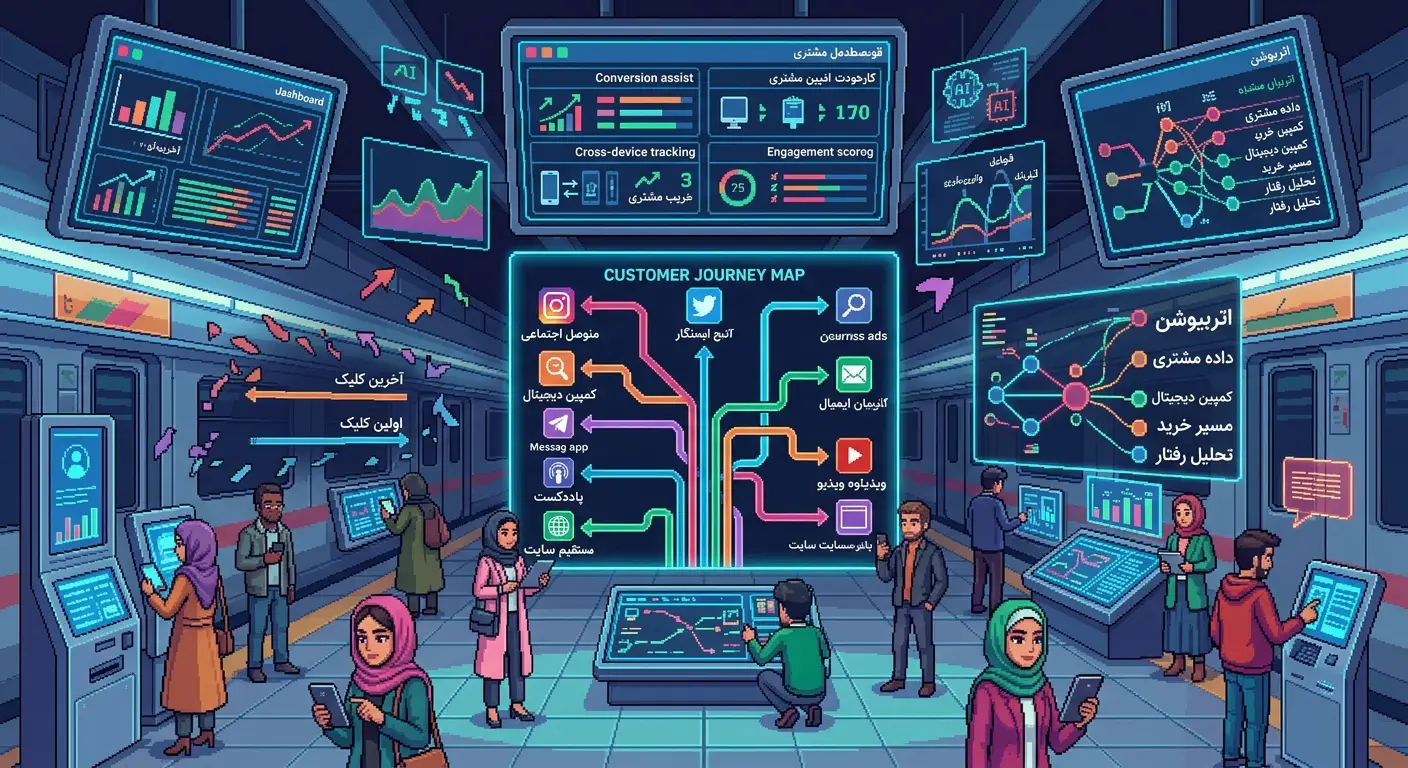
10. An Unclear User Journey
Users Do Not Know Where to Start…and Give Up
If users do not know:
- Where to click
- What the next step is
- What the page is for
their minds become overwhelmed by uncertainty.
Uncertainty = a negative feeling.
11. An Unsuitable Tone
Text Can Also Make Users Upset, Anxious, or Distrustful
A few examples of mistakes:
- An overly formal tone on a friendly site
- An overly familiar tone on a specialist site
- An advertising tone
- A deceptive tone
- A dry, lifeless tone
The wrong tone creates the wrong personality.
12. Pop-Ups at the Wrong Time
A Good Pop-Up = Help
A Bad Pop-Up = Interruption + Hate
Problems:
- A pop-up on arrival
- A pop-up without a reason
- Several pop-ups one after another
- A pop-up with promotional content
- A pop-up that cannot be closed
The wrong pop-up is one of the main reasons people leave a site.
13. Unclear Buttons
An Unsuitable CTA = User Indecision
Buttons should:
- Have a distinct color
- Have a clear meaning
- Look clearly clickable
Mistakes:
- Buttons that look like links
- Buttons whose color blends into the surroundings
- Buttons with vague text
When users do not know where to click, they feel a “lack of control.”
14. A Poor Mobile Experience
Mobile Users Leave Immediately When the Experience Is Bad
Problems:
- Small fonts
- Horizontal scrolling
- Cluttered elements
- Inconsistent proportions
- Slow speed
- Forms not designed for mobile
These create feelings of:
- Heaviness
- Clutter
- Difficulty
- Anger
- Being disregarded
Summary: Bad Design Is Not Just Bad-Looking—it Creates Bad Feelings
Design mistakes go beyond appearance and directly affect users' emotions.
Negative feelings lead to negative decisions:
- Leaving the site
- Not making a purchase
- Distrust
- Not returning
- Not recommending the brand
To create a positive experience, the design does not need to be unusual or complicated—it simply needs to remove the mistakes that undermine users' emotions.
And remember:
**Good design = good feelings
Bad design = bad feelings**