Colors are among the most powerful emotional tools in web design. Each color can trigger different reactions in users’ minds and emotions, from calm to excitement, trust, seriousness, or even anxiety. Professional web designers know that choosing colors is not merely an aesthetic decision; it is a psychological one that directly affects users’ behavior and perception.
In this article, we take a close look at the role of color on websites, explain how the right color combination can improve the user experience, and explore how the wrong choices can create unpleasant feelings.
Color as a Wordless Language
People naturally respond to colors. For thousands of years, our brains have used color as a signal of danger, safety, joy, vitality, or calm. These natural patterns are active in the digital world, too.
When we visit a website, its color palette affects us before we even read its content. Colors can:
- Change how much we trust a brand
- Shape how we feel about products
- Encourage us to continue or turn us away
- Calm or unsettle us
That is why color design on a website is not merely decorative; it is a brand’s emotional and behavioral language.
The Psychology of Primary Colors
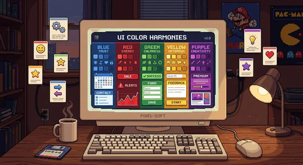
Blue: Trust, Calm, Professionalism
Blue is one of the most popular colors in web design. It typically creates a sense of security and stability. Banking, corporate, and technology websites often use blue because people tend to perceive it as a sign of trustworthiness.
Red: Excitement, Urgency, Energy
Red grabs attention and can increase heart rate. It is often used for CTAs (call-to-action buttons) or discounts. Used excessively, however, it can create anxiety.
Green: Balance, Nature, Health
Green suggests growth, health, and calm. It is widely used on websites related to the environment, health, or natural products. Because green is easy on the eyes, it is also suitable for backgrounds that appear across long pages.
Yellow: Joy, Warning, Energy
Yellow is an optimistic color, but too much of it can be tiring or even stressful. It works well for drawing attention to specific areas, but is not suitable for extensive use throughout an interface.
Black: Power, Luxury, Seriousness
Black conveys a sense of luxury and professionalism. Fashion brands, high-end technology companies, and sellers of expensive products often use dark shades.
White: Simplicity, Purity, Minimalism
White creates empty space and is widely used in minimalist design. Used well, white creates visual “breathing room” and makes a site’s content easier to read.
Color Combinations: Harmony or Chaos?
Choosing the right color matters, but it is the combination of colors that gives a website its personality. Color palettes can be:
- Harmonious and calm
- Energetic and dynamic
- Classic and formal
- Or even discordant and unpleasant
Poor combinations can cause “visual fatigue” or even prompt users to leave the site quickly.
For example:
- Navy blue paired with white feels professional.
- Yellow paired with black conveys warning or urgency.
- Pink paired with purple conveys softness and creativity.
Professional designers generally use principles such as the color wheel and luminance balance to create effective palettes.
Color Contrast and Readability: Essential to Comfort
One of the most important color-related UX principles is contrast. If text and background colors do not have enough contrast, text becomes hard to read and users feel fatigued.
For example:
- Light gray text on a white background
- Yellow text on a green background
- Or blue text on a black background
can reduce readability. This not only weakens the user experience but also creates discomfort and frustration.
By contrast, sufficient contrast lets users process information effortlessly.
Colors and User Behavior: Emotional Decision-Making
Colors can change user behavior. Studies have shown that:
- Red buttons generate more CTR on some websites
- Pages with bright colors keep users engaged longer
- Blue creates a sense of security on login pages
- Gray may feel low-energy
These effects show that colors are not merely aesthetic elements; they are behavioral stimuli.
Colors and Brand Identity: Why Consistency Matters
In the digital world, brand identity is recognized largely through color. Companies with a distinct, consistent palette appear more trustworthy and professional to users.
Using conflicting colors or constantly changing the palette can:
- Create a sense of instability
- Confuse users
- Reduce trust in the brand
That is why major brands generally have detailed color guidelines.
The Cultural Role of Colors
The meaning of colors is not the same across cultures. For example:
- In some countries, white symbolizes weddings; in others, it symbolizes mourning.
- In some cultures, red means good luck; in others, it signals danger.
- In many cultures, gold symbolizes wealth and success.
Web designers working globally should take cultural sensitivities into account when choosing colors.
Colors and Accessibility
It is essential to consider users with low vision or color blindness. Many people cannot distinguish certain colors accurately.
Key principles include:
- Using high contrast
- Not relying solely on color to convey information
- Offering a choice of dark or light theme
Following these principles makes a site usable by everyone.
Conclusion
Colors are part of a website’s emotional personality. Every color choice can convey a particular message, create a specific feeling, and change user behavior.
For effective design, you should:
- Understand the psychology of colors
- Choose a harmonious palette
- Maintain appropriate contrast
- Consider culture and accessibility
- And use colors to create a trustworthy identity
A website with the right color palette can be not only beautiful but also create a positive, calming, or inspiring feeling—ultimately strengthening the user experience.